Showing posts with label serena. Show all posts

Monday, 4 February 2013

Slasher typography


When researching typography used within the same sub-genre as our film opening, it became clear that many stuck to the use of Serif fonts and using the colours red, black and white. The colour red connotes things such as blood, gore and danger and seeing as these are some of the things expected by the audience in a horror film, it fits the audiences expectations which is why it's repetitively used for the text.
The typography used for Scream is repetitive over the series of films which makes it unique to the film, the use of bold white writing makes it stand out against those all with similar red, serif titles. The use of white more than red is most likely because it's more modern than Prom Night, Texas Chainsaw and A Nightmare on Elm Street and the older films are those which conformed to the conventions more than now. Although the Smiley film is modern, it has stuck to the conventions and used a deep red for the title, a deeper shade of red to the older films, one that looks like a shade of blood rather than a bright red colour.
The Cornered! typography is the one that goes against the conventions mostly, with use of Sans Serif font and the colours green and white/grey, again one that is more modern than one that stuck to audiences. Into The Darkness and The Final Destination are another two typographies that subvert the audience expectations with a lack of the colour red within them, both being more modern.
The Final Destination text looks as though it's reflecting light, which linked to the smashed mirror in the graphology of the poster, it linked the two together. If we could incorporate something from within our opening/film with the typography, I think it'd be interesting and different.

Sunday, 3 February 2013

Evaluation of filming day 2

With a few hours spare on a Saturday and with one of it main actors free from work, we decided to use these hours productively and film what we could with this one character, Heather. We thought that the weather had taken a turn for the worst when it began to spit on the way to the woods but it stopped which was good.

It took us approximately 45 minutes to film 4 shots and get them exactly how we wanted which we all thought was a good use of time as this means that if we stick to this pace, on our next filming day, we should be able to get a lot done in just a few hours. We would say that we have around 20% filmed now as we have to refill what we have already filmed because of certain issues with our characters being too over exaggerated and another changing their image.

Monday, 14 January 2013

Mise En Scene post

We used Elyse as the girly, "slutty" character in our opening because of her blonde hair, blonde hair being a stereotype of a girly girl. We used a lot of make up on her face, (a lot of eye shadow, heavy coverage foundation and a bright lipstick), summery and little clothing in winter to attempt to show her lack of awareness of things around her and how she cares more for her looks than health and also we curled her hair fully to emphasise this and how she cares more for her looks and appearance. Elyse's nails were pink and glittery which emphasises her femininity.

Heather and Stevie, the couple, were dressed similar to try and make them look together as one as if they were in sync. They wore dark denim bottoms, heather wore dark denim shorts and stevie wore dark denim jeans. By putting heather in shorts it magnified her femininity when with Stevie as the shorts had a girly look to them. We chose these to characters because they both have dark hair and a similar completion reinforcing the fact they are in sync and like one person. The only difference with the hair is heather has blonde dip dye and so we used this as maybe she is a slightly slutty character (relating to the blonde hair of Elyse) this parts her from Stevie and so maybe she is thinking about ending the relationship. Heather had red nails connoting her passionate feelings.

Shay wears dark clothes because he's not an eccentric character but we can see that he is obsessed with his looks because of his expensive footwear (which is the cause of the argument with Elyse) and large jewellery.

Holly was reading a book called Spilled Blood which we wanted to act as a foreshadow of future events. She wore little makeup to show her little interest in what she looks like, and her neat and tidy plaits show her focus on organisation which is emphasised by her glasses because of the stereotype of geeks wearing glasses.

Thursday, 10 January 2013

Evaluation of filming day 1

Our group were definitely prepared for our day of filming, other than some issues about the date and some of our actors not being able to make the date that we set first of all because of issues out of our hand, when we set another date, we all managed to make it and on time. Because we all met early in the morning, it meant that we could get costumes and make up finalised on the actors and set off to our set early enough to have time to film certain shots over and over again which mean we could eliminate small errors that were made.
We also had a shooting script which helped a lot as we had a schedule that we aimed to stick to, we knew wheat we wanted to get done, because we managed to stick to the schedule that we had planned, it meant that we got around 40% of what we need, filmed all in one day and if we do the same for the next shooting day,new should be able to spend more time editing our piece than filming it.
One big issue that we found whilst shooting was, because we were in the woods, there were a lot of birds and we couldn't do anything to drown out the sound of them.


Wound: test run

After our first shooting session, we done a test run of the wound that we plan to use on the dead character at the end of our opening scene.
I planned to use the same method as when I practised on my arm, using face paints, some make up and theatrical wax, but at the time we didn't have any eyelash glue so the wound that I moulded wasn't sticking to Elyse's skin which proved annoying when trying to put foundation and make up on the theatrical wax as it kept lifting up from her skin and wouldn't stay down which made it look less realistic.
I think that the colours I used to create the blood/gore looked realistic and when filming the wound to see what it would look like on camera, the colours looked realistic, it was just the theatrical wax and where you could see the end of it that didn't look realistic. If we decide to use this wound within our scene, I will ensure that we have eyelash glue so that the wound will be firmly stuck to Elyse and that it will not lift up from her skin, this will mean that I can make sure that the ends of the theatrical wax are spread smoothly onto her skin so when covered with foundation, you will barely be able to where the theatrical wax becomes her actual skin.
The bottom photo shows how visible the theatrical wax was up close and this is what I want to avoid.


Monday, 17 December 2012

Orphan deconstruction


  • With each gun shot that is heard, a jumpcut is used to show another establishing shot of the forest.
  • The vertical compositions of each establishing shot of the forest show strength, which the gun shots conform to because at first, we do not know what is being shot at
  • The white of the sky and the snow connotes purity and innocence which Jimmy conforms to as he doesn't mean wrong by shooting the targets, and when he hits the bird, he shows guilt. It contrasts with the black/dark brown of the tree connoting the upcoming suffering of the bird.

  • Tight framing is used here to show that what he has done to the bird cannot be undone, he cannotundo the actions that he has just done.
  • The shot is close up which shows his emotions when he realises that he has done wrong and that he's caused pain to the pigeon which a conventional childs reaction would be.
  • Non-diegetic low sound is included when Esther comes into the shot later on, maybe to connote the danger that she brings
  • The shot is open which gives it a more natural and simple look also making it unstructured
  • He's placed in the middle of the shot which shows his importance.
  • In this shot, Esther's stern expression is clearly visible, she doesn't give a child-like reaction to the situation
  • The clothing that she is wearing it very mature for a child, more like adult clothing, with it all being quite pristine, dark and neat. It juxtposes his clothing with his jacket hanging loosely on him as a child is expected.
  • When Esther says to him that he should "put it out of his misery" it's as thought she sees no sympathy for Jimmy and that she doesn't care about the guilt that he is feeling, she just wants to cause him more pain.
  • She its the blame on him when she says that "its your [his] responsibility" as though it his fault and it wasn't an accident
  • When Esther says to Jummy "walk away now and it'll starve to death", she quite clearly puts it how it is as an adult would when telling off a child for example, she doesn't care that he's upset.
  • She's at the left hand side of the shot which means that she is the first thing that we would look at, that she is the dominant character here.
  • After Esther kills the bird, we're shown this loosley framed shot which gives the characters space to move which is shown with the boy running away from what's just happened
  • She is standing up hill to where he is, which suggests that she's more powerful than him, that she has power over the way he feels because she's just caused him more upset. 
  • There's a high lighting key due to the fact that the snow and sky brighten up the shot, and the density is moderate, as although there's some information to the shot, there's not a lot. They both keep the scene as non-artificial as possible.
  • The girls are at a intimate distance to each other, where as the boy is at a social distance showing the audience the relationship between the three characters.

Tuesday, 11 December 2012

Wounds continued.


When researching tutorial videos/instruction links on how to create wounds, many of them used theatrical modelling wax so I ordered some and whilst waiting for it to arrive I decided to try and use eye lash glue again to attempt to create a bigger wound to see if it would work. I used 3 different shades of lipsticks as they were all I had at the time but because one was a skin tone just tinted red which made the skin around it look sore, I had a burgundy colour and a red one and tried to use them both together to make the inside of the fake cut look sore/bloody but I feel that if I could've had something a few shades darker, it could've made it look more realistic as the cut would've been made to look as though it was deeper. Up close it doesn't look realistic but I feel that with more makeup it could be made to. From a far I think that it does actually look pretty realistic and I used dark shades of blushed on my arms to make it look as though it'd been bruised/battered. 


When the modelling wax arrived, I'd also gathered together some face paints and foundation. I found the modelling wax really hard to work with as it wasn't really sticking to my skin so I had to use eyelash glue to keep it stuck on, it also kept peeling off at the corners, I used a spoon to smooth down the edges on to my skin to make it look as thought the fake skin was in fact my skin but it didn't smooth very well and kept coming off so I tried gluing it to my skin again using eye lash glue and it worked to keep the wax to my skin but the edges were still rough and were not going smoother, just breaking off. So I left the shape I'd made on my arm with the wax and moved on to using the facepaint to make it look bloody. I used black, green and red, mixing the black and red to make a darker shade of red, more of a bloody shade. I think that the colours look realistic, and from a far it could look believable but I think that the modelling wax was an issue as it wouldn't mold into a shape that was easier to work with without breaking. I feel that in the photo highlighted yellow is where this technique looks most realistic. 


I also tried creating scars with the eyelash glue and also the modelling wax, and I think that the eyelash glue looks more realistic than the modelling wax. I just covered the eyelash glue (right) with foundation when it was dry which made a raised line which could appear as a scar and looks realistic. I feel that the modelling wax (left) does look realistic but the foundation didn't stick to it as well and it still looks a different colour to my skin. 


Sunday, 9 December 2012

Survey analysis

When we posted the questionnaire online, we managed to get 75 answers to each question, so here the results have been put into tables and the results have been analysed. 


http://messmediatownley.blogspot.co.uk/2013/01/editing.html

Sunday, 2 December 2012

Wounds 1

Using just things I found around the house, I experimented with what I could make that looks like something caused by pain. Because I used things that I found around the house, I didn't have materials such as liquid latex so I couldn't do big wounds so I focused on a small wound using lipstick, blusher, eye lash glue, one brush and some tweezers.
When the glue dried, it dried quite clear and not white which meant that it looked more like skin than glue. It stuck really well to the skin and when I used the tweezers to make a slit down the middle of the line that I had created, it was also really easy because the glue is flexible. I found different things that were in a red shade, different lipsticks and blusher and tried them to see which worked best or which would look most realistic and I think that using them all made it look most realistic but in my opinion, I don't think that the cut looks completely realistic when up close, more from a distance. I think that if the cut was smaller and maybe somewhere on the face, it would look more realistic. During experimenting with the cut, I tried to use fake skin but it made my skin rash, so when using certain products, I must make sure that they don't cause a reaction to the person that they're on.


I also found different shades of eye shadow which I tried to shade differently to create a bruise but the colours didn't very well and also I started off blending them on my hand, and a hand isn't really a place that a bruise would be effective, so I used my brothers face to see if I could make a realistic bruise but I feel that the colours aren't strong enough. The colours mixed and looked more brown than a greeny/purple that bruises usually are. When I have to resources, I will attempt to use other techniques to create bruises and cuts. 


When researching, I also came across two links which I would really like to try and adapt if I can get hold of the correct resources and both shouldn't cost too much.
http://www.instructables.com/id/How-To-Create-Realistic-Cuts-Quick-Cheap/
http://www.instructables.com/id/How-To-Make-A-Zombie-Flesh-Wound/

Sunday, 25 November 2012

Deconstruction of Chernobyl Diaries Trailer


  • The establishing shot of the four friends together after seeing them on their journeys through different countries enjoying themselves gives the audience a false sense of security. 
  • Only until after this scene do we see anything that connotes danger. The non-diegetic sound of an alarm is played suggesting that something is about to go wrong on their "extreme tourism" trip. 
  • The writing is on a red strip, which connotes danger and death. The writing on the red strips reveals what happened in Chernobyl which is where the group are visiting. This leaves the audience worried for whats coming next for the characters. 


  • This high angle shot from a balcony suggests that they're being watched from the moment they enter the site. 


  • The close-up shot of the camera and the photo that has been taken on it whilst the female character is zooming in on one window makes it clear to us that she has spotted someone out of the normal in her photo and from what we can see as the audience, it looks as though it is a ghost. 
  • A non-diegetic laugh is included with this shot, it sounds like a childs laugh which seems completely unconnected to the characters so we relate it to the area that they're within. 
  • There is also a sudden zoom into the camera which is paired with a loud non-diegetic sound which shocks the audience, maybe to panic them. 


  • Straight after the shot above, a high angle shot makes it look as though the group are being watched as they're in the car. It's as though it's being repeated to show that they're being watched from different angles, maybe by different things. 
  • The non-diegetic sound of the childs laugh acts as a sound bridge between the two shots. 


  • This medium shot of the female character is tightly framed, as though she cannot escape from where she is. 
  • As the audience we can see a dark figure at the bottom of the stairs that she has not noticed, this makes us worry for her as from the previous events that we have seen, it's highly suggested to us that this is going to be something in the character's favour. 
  • Non-diegetic sound which sounds like somebody breathing heavily is included here which also adds to the mystery of what's going on because it is not indicated to us that the breathing is coming from any of the other characters. 
  • After this shot, we see the other characters being distracted by a child figure that has appeared which acts as a distraction because we then hear a very sudden scream and the shot goes straight back the the female character (above) being dragged down the stairs (above). 


Inspiration- Costumes

Shaun of the Dead and 28 Weeks Later.

When looking at the costumes used for zombies in films, they seem to always be dressed in normal clothes that have just been blood stained. Also the use of contact lenses to change the colour of the characters eyes are used in Shaun of the Dead which separates them from the other characters within the films that are human.


American Psycho. 

Throughout American Psycho, Patrick, the protagonist wears this costume, it subverts the audiences expectations of his character as he is a murderer dressed in what seems to be just a normal business man's suit, and the audiences expectations of a man in a suit is just a working class man, who works somewhere like the city. His suit looks very pristine all of the time, which reflects his character which is revealed to us in the opening of the film and how that he cares very much about his appearance, we begin to understand his vanity, yet has no emotions. During the film, he puts on a plastic anorak type jacket which allows him to axe another character to death, preventing any harm to his immaculate suit, when he is done with the murder, he removes the jacket to reveal his suit again to show that it has gone unaffected by the murder, just like the character has. 


Orphan. 

This costume that is worn by Esther in Orphan contrasts with the character that she is. The audiences expectations of this character would be an innocent child, as that is usually how children are perceived and her outfit suggests no different to that at a first glance. This contrasts widely with the idea of good vs evil, with her being evil whilst dressed in a child's outfit. The old fashioned dress that she is wearing is collared and patterned which suggests that she is one of many. Also her ribbon around her neck and wrist are both a deep shade of red, which connote death. Her hair is slicked back with ribbons, which again adds to her innocence and to the fact that she is a child contrasting with the evil character that she actually is.

Tuesday, 20 November 2012

Se7en Opening Credits Deconstruction - Mollie, Seyi, Serena, Ella

The extreme close up shots of the fingers can indicate many things, firstly the uncleanliness under the nails seems to resemble blood which gives us the indication that this man has been in contact with a bloody item e.g. a dead body or a wounded person. Secondly this man also is shaving the skin off his fingers, not cutting his nails but shaving the skin off his fingers which is a form of self harming when looked at literally.
Secondly the sound being used when a jump cut is applied is extremely sharp, it resembles an abrupt sound like a car screeching etc, it brings in a psychological factor into the scene as the sound only comes when he is examining the blade and not cutting himself anymore.

To confirm that this man has actually hurt himself another extreme close up shot is shown when there is another extreme close up shot of him placing a tea bag within a cup of water, his fingers slip into the shot showing one of the fingers with a plaster showing that he was in need of minor medical care as a result of his actions, also when he is filing through a sorting cabinet, his fingers are also shown plastered.


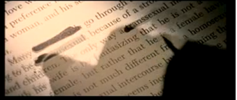
Throughout the opening, we see a book being featured with this we see words that are cut out and altered too it. These words that have been shot to show they have been removed from this book with the use of a pen covering the words, ‘transsexual’ and ‘intercourse’, this may be to the protagonist seeing words as a bad influence, therefore we can infer that the book being shown is a Bible. 

In addition to this, the close up shot of the word ‘God’ has been removed, however the protagonist leaves the remaining of the text. Camera angles show the Bible with close ups and extreme close ups, often from the side showing the thickness of the book and we are able to see how each page is turned slowly, but also from the protagonists point of view. 

Speeding up the non-diegetic sound track when different shots of the book are shown as the credits move along adds a disjointed effect and sound effects have been added to create tension every time a new shot of the Bible is featured. A flashback of the book being turned is used frequently throughout the opening credits, this features several times, emphasising the protagonist working through the book and developing what they are doing. The Bible is very thick and we can see how it includes a lot of pages, and we can see how the colours are not a pure white and have a yellow tint, which is aided by the lighting, which emphasises the fact that the book is old.


Colour is used heavily throughout the clip in different ways. On example of this is the colour red. Red is used as a dominant colour throughout the clip. It is used as a film over the picture of the child that has been scribbled out.


The red in this shot covers most of the screen and also turned the black scribble red as well. This shows the death is frequent within the story. It also can be connoted as danger for the victims of the murders.

The other colours heavily used are black and white. Black and white are used in the typography as well as the actual clip. The colour black is the dominant colour of the two because by having
the white against the black background shows that innocence of the victims is much less significant than the suffering they feel. Black can also connote the mystery in their deaths.


The colours with and red are rarely ever used together. This may be to connote that the danger does not effect the innocence of the victim before they are murdered.


Friday, 16 November 2012

Inspiration- Death scene


  • We can clearly see the water seeping towards him, foreshadowing the oncoming events. We see the beginning of his death start from his feet when he slips and when his life ends, we're shown first by his feet loosing movement/life. 
  • The non-diegetic sound that accompanies the slip creates tension as its a conventional piece of music used in films to create tension, with a quite low tone, getting louder and then stopping, in this case when his foot slips. 


  • Whilst we see Tod struggling to free himself from the plug from the medium shot, there's a jump cut to a point of view shot of the shower head showing us what Tod is currently seeing is his current state of panic. 
  • The shot is slightly canted and it jolts when on the screen to show his sudden movements and panic. 


  • This close-up shot of Tod shows the fear in his eyes and also blood shooting through his eyes has been edited in. 
  • Soon after we see him looking at the animals in the cabinet that appear to have their eyes in his direction as though they're watching him which juxtaposes the father, who we see soon after the animals, asleep in another room as he's someone that could help but he's unaware of what's going on in the bathroom. 
  • Diegetic sound of Tod suffocating is included here. 


  • A clock is also shown ticking and the sound of the clock is also included making it clear that time is going on and as time goes on, the close Tod is getting to his death. 


  • We see Tod's toes curling in his state of panic, as though he is putting in everything he possibly can, all of his strength even down to his toes, but then we see his feet lose movement completely a few seconds later and this is when we know that his life has come to an end. 
  • The non-diegetic sound that accompanies this section speeds up and also gets louder as the end of his life comes, and when his life ends, the sound stops and we only hear one high note until the end of the scene. 

  • Tod is almost always tightly framed, as if he cannot escape what is happening to him.
  • Also the shots jump cut from one another quite quickly and we never see Tod for more than a few seconds which means that a scene like this could be shot in many different shots an edited together which makes it easier for the character to act more realistically and also when editing.