Typography -
- The typography looks handwriting and almost childlike.
- the white against the black background showed innocence of the victims against the suffering they feel and the mystery of their deaths.
- the writing also has a loose framing showing the isolation of the victims before their deaths.

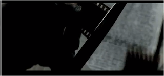
The first shot is a shot of the 'killer' cutting some film. It is a close up shot to show the audience exactly what he's doing.
The next shot is a close up of the 'killer' cutting a picture up. It is also a close up as the graphic match is of the scissors he is using to cut up the items.
- while the credits are being shown flashes of evidence comes up on the screen.
- this gives the audience clues to the murder that are revealed later on in the film.
- Clues are shown throughout the opening titles.
- for example this shot is a close up of a drawing of one of the murders.
- this again gives a clue as to what will happen later on in the film.


No comments:
Post a Comment